|
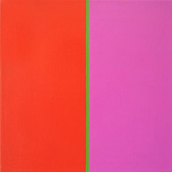
In the various images of the exhibition Colour Vibration the artist Renate Kasper deals with light equivalent colours,i.e. with colours of similar white mixture. The respective colours, for example , red and pink in the series Momentlinie are related to each other and result in a kind of colour talks. The individual colours are hardly perceptible since each colour defines the other one. Already by Henri Matisse we know, that a colour alters as soon as it is presented next to another colour. A red beside a pink has not the same effect as a red next to a green.The respective colour seems to alter its tone, to become darker or lighter, stronger or softer, even louder or quieter. Each colour contains a little of the neighbouring colour tone since colour is also expansion. At the same time the complementary colour is automatically included to achieve a balance.
The images by Renate Kasper show ,that colour never is seen as what it really is. Colour becomes a relative mean of art.Colour fools. The same colour may have innumerable readings.
The image series YALA is a search for colour quality as well as a play of its weight. Quantity and quality form a balance. By means of the light parity the artist gives the negative and the positive the same significance: the forms as well as the boundaries seem to dissolve in the eye of the viewer. There are no disturbances in the images. They show the regularity created by the artist, which is present only approximately in nature as for example in the salt crystal. These regularities form a contrast to the confusions of the outer world. The work aims at laws and ordres being presented here by geometrical forms which are not seperable from sensibility. This is visualized by structures penetrated by the light of the colour. Thus a conflict arises between the absolute and the relative. The absolute of the geometrical form dissolves in the light of the colour. At the same moment when certainty appears to be evident it collapses again. The eye cannot grasp the composition and the previously clear structure begins to shake (Aporie).
Shown are images of perception. The relation between viewer and image changes depending on space,light and colour. The direct perception is a concentration upon the presence. What one immediately perceives provides an impulse to think. Every moment is a begin and allows to look anew at the well-known.
What is needed at the time being for a clear perception is discipline and sensuality. Discipline is visible in the discrete structure of the geometry, the sensuality in the colour. The essential becomes conspicuous by the representation of the simple. Thus the unvisible becomes perceivable and every image stands for a little prayer.
Ulrike Neuhuys, Paris
(translation: Dr. Ekkehard Mittelstaedt)
biography
1939 first days of life in Speyer
1961 first pictures, studies with Hans Meyboden, Karlsruhe and Freiburg
1974 first experiments regarding colour and space according to nature, studies with Hans Hollaender, Aachen
1982 first experiments regarding painting and music
1984 first strucural systems studies with Almir Mavignier, Hamburg
1990 first self-similar structures with colours of equivalent light
1997 first linear structures
2003 first space graduations
2004 first book objects
2005 first works with white: Differences
|
|